State highway sign designs, judged
Apr. 17th, 2024 10:05 am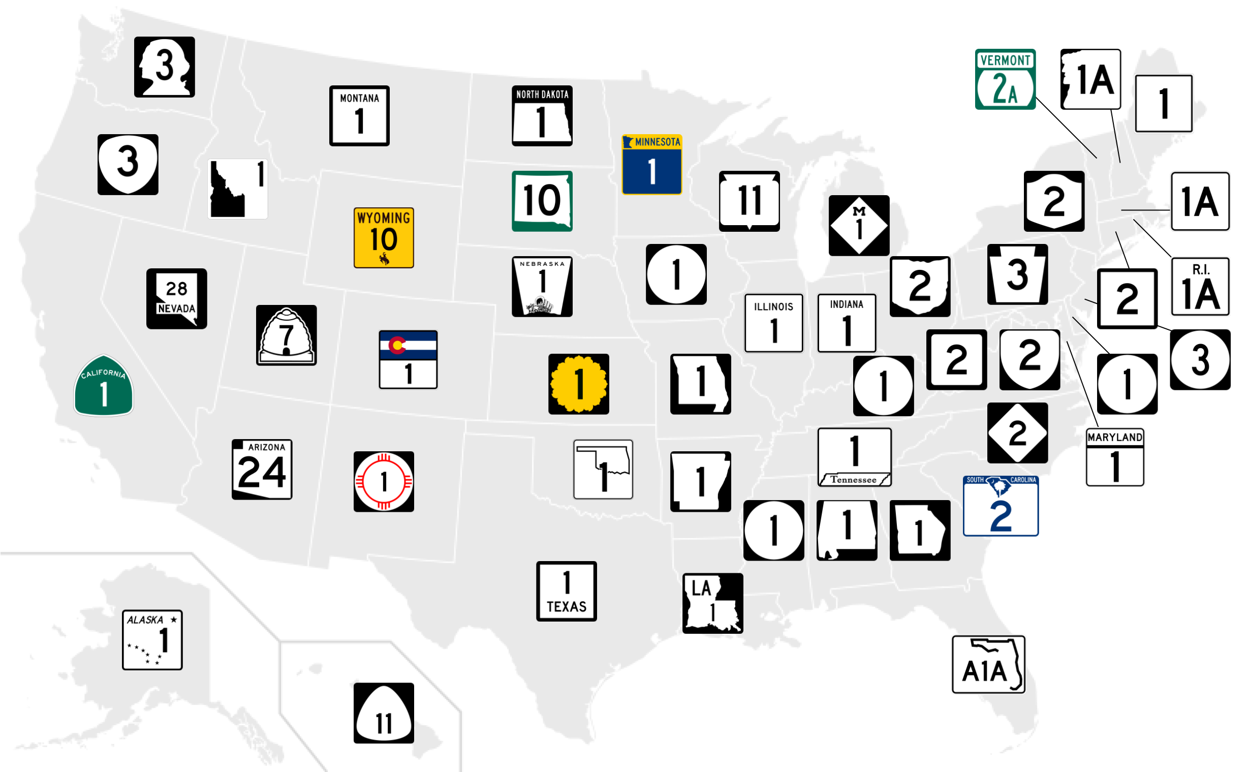
Map from https://www.reddit.com/r/MapPorn/comments/1arvr8r/state_highway_marker_designs_for_every_us_state/
Maine, Massachusetts, Connecticut, West Virginia: plain squares. Normal, reasonable.
New Jersey, Delaware, Kentucky, Mississippi, Iowa: plain circles. Also fine.
Rhode Island, Maryland, Indiana, Illinois, Texas, Montana: Plain squares with the state name. Helpful if you can’t remember what state you’re in, I guess.
New York, Virginia, North Carolina, Wisconsin, Oregon, Hawaii: A little more creative than the basic square or circle, but still a nice, simple sign shape. Several of them are shield shapes, reminiscent of the US Highway and Interstate Highway signs, which is also a nice touch.
Vermont, California: Add the state name and a bit of color to an otherwise simple shape. Not too bad. But also, I live in California and the state highway signs don’t always have the word “California” on them. How many of these are exaggerated?
Michigan: That big M in that font is the logo of the University of Michigan. Sure do love their college football, Michiganders.
New Hampshire, Pennsylvania. A recognizable state symbol that still makes a fairly simple sign shape without getting in-your-face about it. Minus points to New Hampshire for still using as a state symbol a rock formation that collapsed in 2003.
New Mexico: The red Zia sun symbol is one of the best emblems of any state and fits well with a simple round sign. Having to fit around the number makes the proportions a bit wonky but overall I like it.
Kansas: Oh, I get it, it’s a sunflower. I like the concept and the shape, but I worry that in yellow it could get mistaken for a caution sign.
Utah: The drawing of a beehive is a little cartoonish; more detail than a highway sign needs. Pushing it.
Washington: The head of George Washington is just a terrible shape for a sign. Ridiculous, absolutely not.
Ohio, Georgia, Alabama, Arkansas, Missouri, South Dakota. Using the shape of your state as the shape of a sign sometimes works, and definitely communicates that they’re state highways. I’ll allow it. Bonus points to Ohio for having a state that’s actually shaped like a shield.
Louisiana, North Dakota, Arizona: State map and name seems a little redundant in my opinion.
Florida, Tennessee, Oklahoma, Idaho, Nevada: States that aren’t well suited to be the shape of a sign, but they squeeze them in there anyway. Trying too hard.
Minnesota: Tiny map and state name and multiple colors, too much going on.
Nebraska, Wyoming, Alaska. Simple shapes with the state name on top and a symbol on the bottom. These ones seem a little crowded, and the symbols are mainly too small to really come across. Alaska is the best of them since the Big Dipper is a simpler design than Wyoming’s cowboy and Nebraska’s Covered Wagon With Two Passengers Being Pulled Over A Hill By A Team Of Oxen.
Colorado: You’d think the state flag would be a good design for a highway sign, but it just comes across as garish and squeezes the number into the bottom half.
South Carolina: State name, and tiny map, and tiny state symbols inside the tiny map? Save it for your license plates, buddy.